The history of well known logo designs.
MasterCard logo

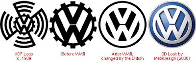
VW logo
Shell logo

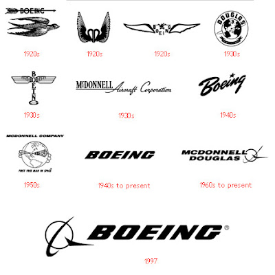
Boeing logo
Alfa Romeo logo

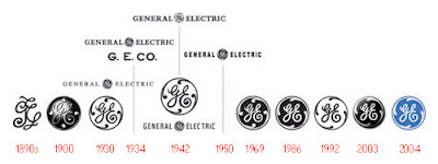
GE logo
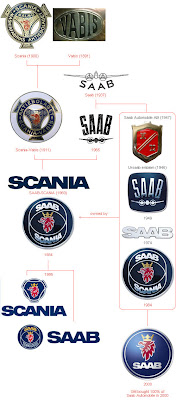
Saab logo
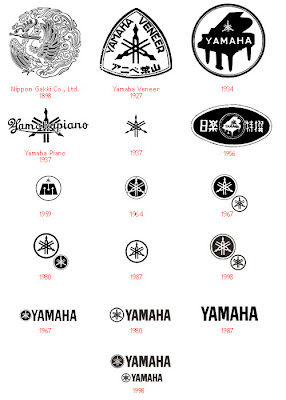
Yamaha logo
Nike logo

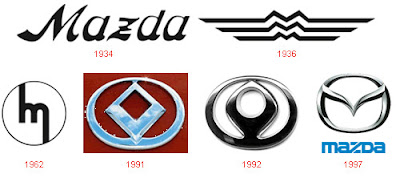
Mazda logo
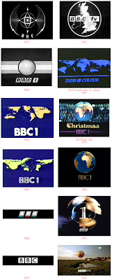
BBC logo
Sony logo

Mercedes-Benz logo

Kodak logo

Nokia logo

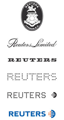
Reuters logo
IBM logo

Starbucks logo

Mitsubishi logo

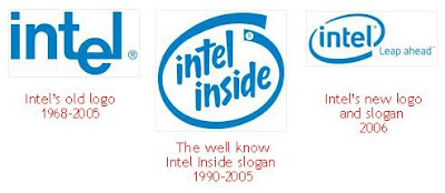
Intel logo
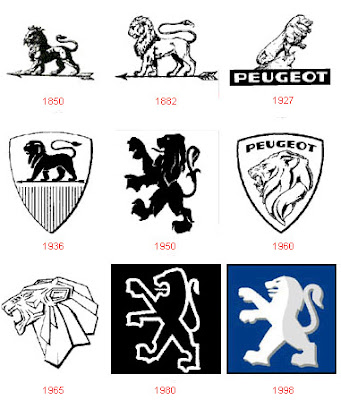
Peugeot logo
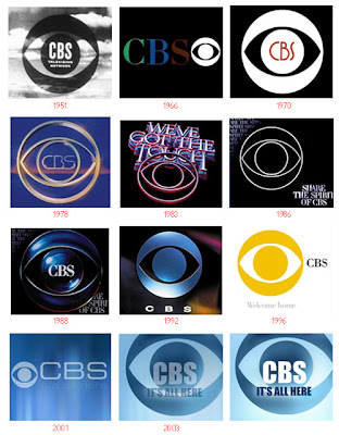
CBS logo
Adobe Systems logo

Pepsi logo

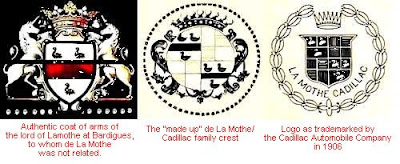
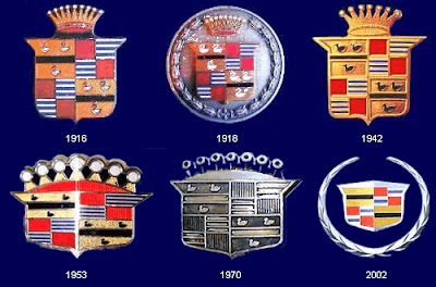
Cadillac logo
Playboy logo

Audi logo

Motorola logo

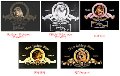
Metro-Goldwyn-Mayer (MGM) logo
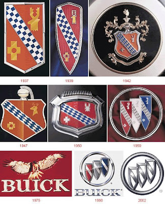
Buick logo

Texaco logo

Fiat logo

Nestle logo

Apple Inc. logo

Ford logo

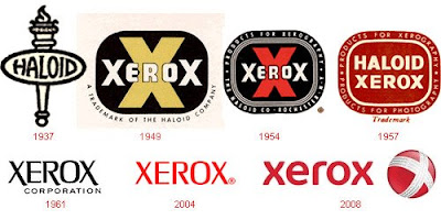
Xerox logo
Canon logo

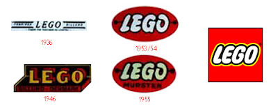
LEGO logo
BMW logo

FedEx logo

Google logo

Mozilla Firefox logo

Manufacturers Life Insurance Company logo

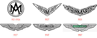
Aston Martin logo
LG Electronics logo

Microsoft logo

Renault logo

Siemens logo

Palm logo

WWF logo

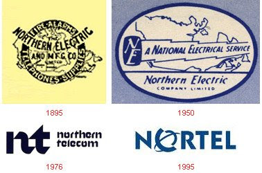
Nortel logo

VW logo

Shell logo

Boeing logo

Alfa Romeo logo

GE logo

Saab logo

Yamaha logo

Nike logo

Mazda logo

BBC logo

Sony logo

Mercedes-Benz logo

Kodak logo

Nokia logo

Reuters logo

IBM logo

Starbucks logo

Mitsubishi logo

Intel logo

Peugeot logo

CBS logo

Adobe Systems logo

Pepsi logo

Cadillac logo


Playboy logo

Audi logo

Motorola logo

Metro-Goldwyn-Mayer (MGM) logo

Buick logo


Texaco logo

Fiat logo

Nestle logo

Apple Inc. logo

Ford logo

Xerox logo

Canon logo

LEGO logo

BMW logo

FedEx logo

Google logo


Mozilla Firefox logo

Manufacturers Life Insurance Company logo

Aston Martin logo

LG Electronics logo

Microsoft logo

Renault logo

Siemens logo

Palm logo

WWF logo

Nortel logo


56 comments:
Good work. I could read a whole book of this sort of thing.
Your blog is great. I love this post.
Your blog is great. Love this post.
Truly a brilliant compendium. Well done.
sony and firefox > all
Gracias por toda esta maravillosa información!!
I love this stuff. I bet you're really good at trivia and quizes! One of my many nerdy hobbies is identifying makes of truck by their logo. I could look at this for days. I'm supposed to be studying for an exam tomorrow and I've just spent an hour lookin' at this. Awesome.
really good look at logo histories. i wouldn't mind reading more about this stuff! the history behind them is almost always interesting.
Good work!
Good Work!
Wonderful! When does your book come out? I'd love to hear some of the discussions this series will spark among designers and teachers of design.
Impressive post. It's amazing how much they've changed, yet stayed the same.
Great stuff! Brought back some good memories
Hi,
very interesting collection.
It's a kind of fascinating that many of them changes to a 3D-look for today's usage.
Cheers,
Stefan
I remember the NBC fiasco over the red, white, and blue "N" - - would like to see that evolution.
This is great. recommend adding the evolution of the Bombardier Logo, including the various deHavilland, Canadair, Learjet, etc, all leading to the current bold BOMBARDIER. Would fit nicely with this collection
This is amazing...awesomely thorough and historical.
You should try to get the evolution of the NCR (National Cash Register) logo. they were bought by ATT in the 90's and spun off several years later. They have something like 20 or more variations.
Evolution of logos... wow how will they look in 50 years from now?
Interesting to see which companies have been virtually unchanged for their entire existence, then to see companies like Palm that had three different names/logos in three years.
Interesting see the cars logo,
on the best, I think You must add the italian best car industry in the history from 1906: LANCIA
here the link of the image
http://www.fiatgroupautomobilespress.com/download/SYSTEM_GALLERY_STORICHE/2-2-410.jpg
Hey - I am a marketer. I love it.
In fact, the revisions make the logos and brands more powerful, IMHO ... more memetic.
The google logo changes all the time. What if a logo changed every day or everytime that it was rendered, but with a few iconic elements?
In any event I think there are better thinks to rethink a brand than investing crazy amounts of $ in logo design: http://twurl.nl/brl46j
What if logos actually emit a signal? http://twurl.nl/0nd8xq
Harley Davidson has claimed the sound of their engines as IP.
I just found this while searching for info on the new Pepsi logo. This is a wonderful collection of world-wide brand history. Thanks for posting it.
I didn't care one way or the other about the new Pepsi id, but I do know that over the years, certain brand evolutions have gotten under my skin, who knows why, subconcious brand affiliation? Personal likes and dislikes? Design/typographic preferences? Seeing this collection will definately cause me to step back and think a bit before I open my mouth and trash or praise a brand refresh in the future.
Nice post, looks like Pepsi just changed theirs again so time for another update!
Now you need to add Wal-Mart's...I just heard they redesigned their logo.
Great Collection, one note though: On the LEGO logo, there was one more iteration, similar to the present one, but the letters were similar and inside the O a yellow border could be seen. Do not know the exact dates for the transition, but searching for LEGO logo on google images you can find both versions.
very informative Good work
Thanks for the delightful survey. I was amused by the Mozilla Firefox entry, as Mozilla had trademark collision issues that required renaming the product twice. Both Phoenix and Firebird were names already used by other open source projects.
My SO looked at the logo and said "It looks like that Firefox is humping that planet!" I told her "Firefox 3 had 8 million downloads the day of release. It is humping that planet!"
Realy nice collection. Doesnt the fact Playboy's has not needed to be updated show its is the best?
A realy great collection.
by the fact it has not had to be 'updated' surly the Playboy logo is best and timeless.
@Pip
So when does a logo need to be updated? And why does it require it?
I suspect we could all point to logo updates that provoke "What were they thinking?" reactions.
The fact that Playboy's logo hasn't been updated simply means that Playboy Enterprises hasn't seen a reason to. But Playboy has other more pressing issues related to a changing environment for magazines and uncertainties in other areas of their business. Playboy's senior management has other things on their minds besides "Hey! Let's change the logo!"
It's my impression that redesigns happen because they must (like when mergers and acquisitions combine companies, or a company decides to change its name), or because someone sees a need to revitalize the branding, or because a new CEO wants to put his stamp on things.
Only in the first case is there an objective need or requirement. The other cases are all subjective, and in some cases arguably wrong.
I like the Playboy logo, but I'd be reluctant to call it "best" or "timeless", just because it hasn't changed.
Bastante interesante, gracias!
Hey,
Keep up the good work!
Brilliant work - I do hope you publish a book (online, please).
WANDERFULL IDIEA, BUT MUST OF THEM ARE MAID UP, RIGHT?
2 Thumbs UP!!!
Really cool and wonderful blog
i like it very much :)
cool!
love it.
Your missing a few important updates - most notably the new Pepsi logo. Other than that this is a great collection and a lot of fun.
Mazda is missing a very important time when they used a type of their name as logo, this would've been from at least the late 70's up to the 90'. They included it again 1997, but in that time, they only used the word mazda on their cars (We've owned 3 Mazdas, two of which had that logo).
Other than that, interesting compilation, good job.
Wonderful we can realise the modernishing the logos thanks
excellent post
Great job, fascinating how we caress and tweak our branding. I seem to remember a brief departure from script in Ford's history that you might have missed---all caps, having block letters with eased edges, typeface unknown and prob custom. check it out.
great blog!
im trying to do similiar things with clothes market.
I'm now convinced about my 'anti-brand' stance. A logo should always evolve and in today's climate of instant gratification ie twitter, sms, facebook etc. There's no reason why we can't all follow in google's footsteps and make it up as we go along?
I don't mean that literally, but yes let's not make a rod for ouur nrand managers' backs! Great Post.
Great collection! Thanks for sharing!
wow these are some really amazing logos n thnx for such nice visual illustrations.
wow these are some really amazing logos n thnx for such nice visual illustrations.
Love your blog - thanks for posting!
i read it twice.
Excellent!!
Excelente aporte de logos y sus avances con el tiempo en su presentacion, sobre marcas muy reconocidas.
10 puntos.
Saludos desde Guatemala
Hi,i want to thank you a lot for the pictures that you had posted,it is a very very excellent and interesting blog for memories about the past. LOl, although i haven't born out that time but since i have saw it now, i finally understood how the big famous company logo's was actually looked like and i love it very very much in appreciation.i am sure all this old school logo's would let my parents remind them of their olden days and they will be glad to see it. Hahas :) Keep it up ! Do keep the year of 2010 logo's (if changed from big company like e.g Apple lnc etc.) for our new 2010 generation childrens to have a better acknowledgement in life to let them know that actually time is indeed very precious like the world,as it keep on revoluting and changing every minutes and seconds everyday 24/7.There is a chinese ancient phrase saying that no matter how hard we fought in life,we should always treasured every mins and secs in life with family or whose ever,as we can't use money to buy the time to transform us back to the past where we were actually doing.Lol,i guessed that was all i wanted to share with all of you.All the best to all of you, may Heaven blessed all of you in great health and stay wealthy always. Best Regards: Jerry :) (Singapore)
best!
Are they real? Because the oldest logo of Apple Inc is really funny.
Excellent Post ! Design your Company Logo, Business Logo with The Logo Crew, leading UK based Logo Design Company.
Post a Comment